Transforming 3 disconnected proposal documents into one seamless experience.
brand strategy / visual design / Interaction Designer
This project challenged me to rethink what a business proposal could be. Faced with an $8 million opportunity, three independent service lines, extensive supporting documentation, and a tight one-week timeline, I shifted the focus from creating a visually appealing document to designing an intuitive user experience. By introducing information architecture, interactive navigation, and a unified content strategy, the proposal became easier to navigate, easier to present, and significantly more cohesive for everyone involved.

Challenge
The project grew rapidly in both scope and complexity. What began as a proposal soon became a challenge of organizing large volumes of information across multiple teams, while delivering a premium experience under a tight deadline.
01
3 separate proposal documents
Audit . Tax . Accounting
02
Heavy on content
100+ pages including supporting files
03
45+ Contributors
Understanding their challenges and thoughts
04
Luxury brand
One of the biggest Retails in America
05
Cognitive Load
Too many documents to read through
Information Architecture
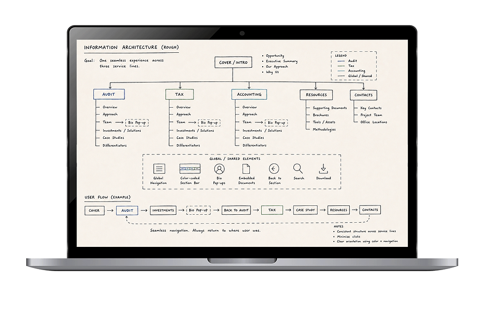
I mapped the content hierarchy to unify three independent service lines into one seamless proposal experience, ensuring users could navigate information effortlessly.
Ideative Navigation
Before committing to a solution, I explored different navigation patterns to balance discoverability, scalability, and ease of use for a document of this size.
Visual Language
Inspired by luxury fashion editorials, I established a clean, restrained visual direction that emphasized clarity, sophistication, and trust over decoration.
Refining Ideas
Early wireframes helped validate navigation, information hierarchy, and interactive elements, allowing stakeholders to provide feedback before high-fidelity design.
Interaction Flow

Designed with user in Mind
With the proposal being developed during the Fourth of July week, many stakeholders and client representatives were traveling or away from their desks. To support quick reviews and faster feedback cycles, I extended the proposal into a responsive mobile experience. The goal wasn't to replicate the desktop layout—it was to preserve the same interactive navigation, embedded resources, and seamless experience so stakeholders could review, comment, and validate content from anywhere.


"What stayed with me..."
This project changed the way I think about design. I walked in expecting to design a proposal, but I walked away realizing I enjoy designing systems, solving problems, and making complex things feel simple. That realization has shaped every design decision I've made since.